Project Details
Title: ml5.js Website Redesign
Role: Lead UI/UX Designer
Tools: Adobe Illustrator, Sketch, Figma, Principle
Overview
ml5js was founded on the premise of making machine learning more accessible by creating a Javascript library that educators, artists, and tinkerers could understand. However, users found the content confusing and hard to access. Daniel Shiffman, the pioneer of accessible coding, asked our team to help identify the website’s target audience, and redesign the site based on its user’s needs.
How can we empower our wide audience of creators and educators to utilize machine learning in their web-based projects without any prior data science knowledge?
Background
There are often high barriers to entry involved with education and machine learning. In the past, this information has been limited to computer scientists, engineers, and data scientists.
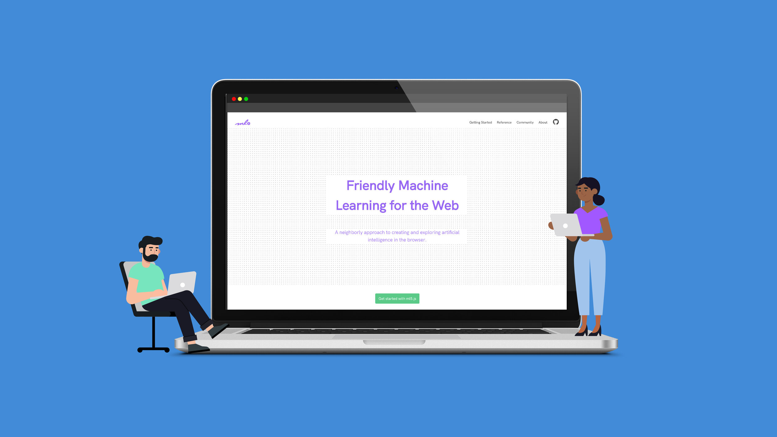
ml5.js is an open-source library that takes a user-friendly approach to machine learning. This web-based platform aims to increase accessibility by breaking down a lot of the technical barriers that continue to mystify machine learning and AI.
To eliminate some of these barriers, ml5js uses a more accessible framework to introduce its audience members to machine learning.
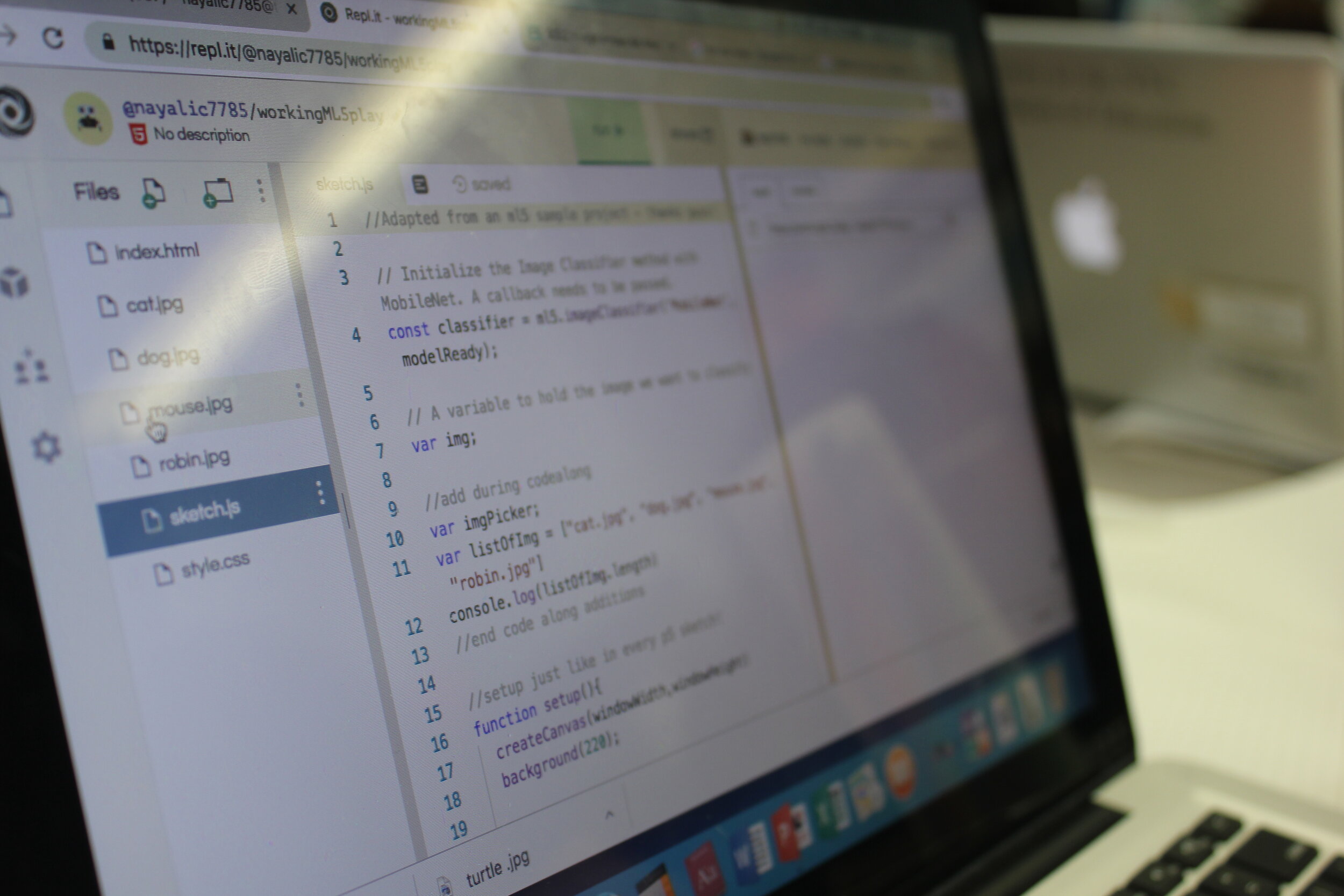
All code is executed through an internet browser, rather than relying on complicated python notebooks or terminal processes.
Works seamlessly with p5js, a coding library with a focus on making web-based creative coding more accessible.
Works as a wrapper for Tensorflow.js and tremendously cuts down the amount of code necessary.
Research and Discovery
We used several research tools and methodologies to collect primary research data. In our efforts, we focused on discovering who exactly the user was: their needs, motivations, and goals. We looked into testing how ml5js’s current offerings performed in meeting those aspects in our user groups.
Survey
Based on the goals below, we had 83 participants complete a 10 question online survey. Distribution channels used to deliver the survey were email list serves through education institutions and affiliate Twitter accounts.
How do we adequately position the site to serve its target audience within the machine learning ecosphere?
What level of coding experience do our users have?
What level of machine learning experience do our users have?
Is our audience already familiar with the ml5 library?
How do the site’s users currently utilize the library?

To eliminate irrelevant answers, the survey was formatted to get general experience information from the audience we were able to reach, followed by one critical decision point, “Have you ever used the ml5js website before?” For those that answered “no”, the survey ended immediately. Those that answered “yes” were directed to further questions about their previous experience using the site. It was very important that the questions were formatted to avoid leading participants, limiting choices, and remaining open ended when appropriate.
Interviews and Observations
Interviews included open ended Q+A a usability test of the previous website. Usability tests required participants to complete a set of tasks while thinking out loud to report their thoughts.
These tests revealed pain points around site architecture and models names as confusion arose. Users found that they needed to have prior knowledge about ML before they could begin to navigate the site with confidence, and often felt frustrated scrolling and clicking back and forth when unable to find the information they needed.
The design team also attended student workshops to get a perspective on how educators introduced machine learning and how well students worked with the library.


Google Analytics
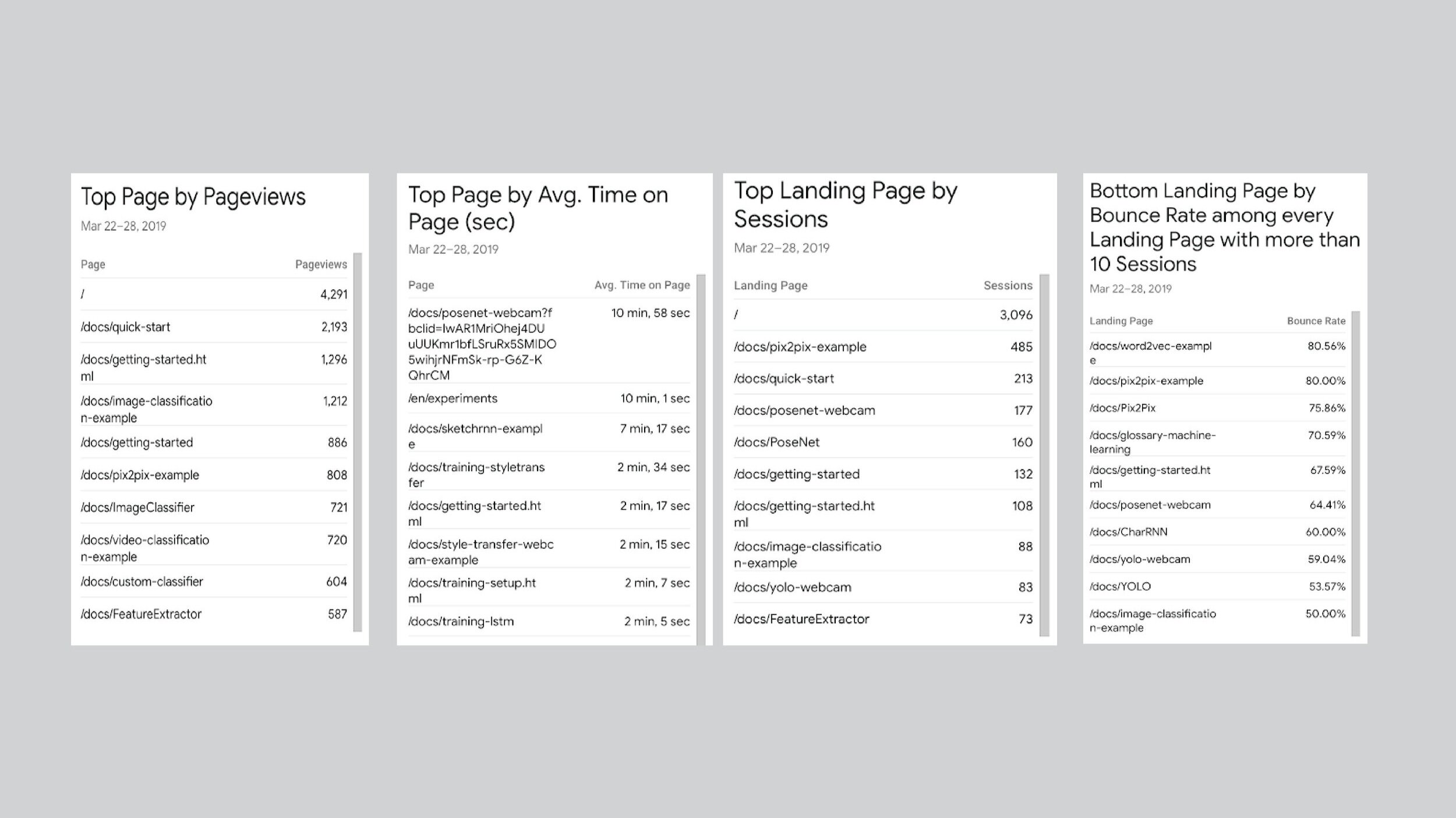
We used Google Analytics to search for trends in user behavior on the site. These metrics helped affirm many of the discoveries we made during usability testing concerning the difficulty of site navigation and terminology confusion. We also used metrics indicating model popularity to help drive new model development in the library.
Model documentation pages had, on average, relatively low time spent amounts. This is highly unexpected because often times, users are sifting through page content while working on their own projects. Do users gather the information they need in such a short amount of time? Or are users clicking out of pages because of confusion or frustration?
Key Findings
#1 Information architecture does not support the users’ mental models or workflows.
“Model names are confusing and why do some links go to Stackoverflow?”
Users found the navigation to be quite confusing. With very little machine learning experience, it was difficult for users to figure out how to get started using the library (“getting started” vs “quick start”), which model documentation page the user should visit, or how to use other sites that more experienced developers had experience using.
#2 Copy write does not reflect users’ experience levels.
“There needs to be more details on the expected inputs and outputs. I don’t know what this model name means, what it needs in order to work, or what the outcome is.”
The survey revealed that 57% of our users had no experience using machine learning libraries or platforms to complete their work. The existing website did not provide any indication as to how each model worked without having to read each documentation page.
#3 Documentation pages introduce a major pain-point for user workflows.
"There’s so much information for each page. It’s hard to tell when one section ends and another begins”
Each model requires a lot of documentation. Each page includes a quick start example code, usage (initialization, properties, methods) demos, more examples, and links to the source code. Pages tend to be very long with all this information, and users find themselves constantly scrolling back and forth and losing track of where to find certain information.
#4 With great power comes great responsibility: using machine learning ethically.
“I don’t know what data I should be using to avoid human bias.”
Often times we fall victim to technological fetishism, yet we don’t know the dangers and implications the wrong use of these technologies can cause. The website failed to educate users on responsible data collection that would avoid implicit bias within their models.
Personas
Based on the data derived from the user research summarized above, personas were crafted to contextualize the information found into users and needs that new redesign should address.


Insights
The site serves primarily as an introduction for many users to machine learning . It’s very important that the site architecture and UI supports user mental models and workflows.
Create a reference page organized by data input to aid model exploration.
Users first introduced to machine learning are unfamiliar with algorithm names and functionalities. By organizing models based on data input, users can narrow down and decide between which library offerings. Almost immediately, users can decide if they can accomplish their project goals without sifting through countless documentation pages.
Utilize side navigation as an outline for library content.
User workflow is often nonlinear, therefore additional navigation UI will support these flows. The side navigation will reflect the functionality of the reference page by listing all library model offerings and easing exploration by categorizing models by data type.
Add a community page for users to find current ML backed projects.
Users new to the creating coding and ml5js community often look for inspiration on ways to implement ML capabilities. A community page will expose users to a wide variety of projects using the ml5 library to create interesting, interactive, web-based work.
Re-imagine content layout to ease workflows.
Documentation pages tend to be lengthy due to the amount of content being presented. Navigating through all this content can be frustrating to users as they rarely work in a linear fashion. Layout and navigation techniques should allow users to go back and forth quickly and efficiently.
Educate users on the importance of equitable data collection.
It’s no secret that technology has its good and bad side. However, users are impervious to why and how. As an introductory library, its important ml5js educates its users, who may very well become future data scientists, how to ethically gather and use data.
Sitemap
A site map was created to highlight the information architecture restructured for the ml5js website. The main navigation consists of all the main contents of the site: revised “Getting Started” and “About” pages, and the new “Reference” and “Community” pages.
The “Getting Started” page now features instructions for “Quick Start”, rather than separating them, along with all helpful introductory information to the library. Any content needed to setup the backend structure of the library will be found here with no confusion.
The side navigation UI is used to aid user flow by working as an easy access table of contents, each section acting as a quick link to jump to sections within the same page.
The new “Reference” page lays out all model offerings for the library. Models are organized by data input types: images, video, text, audio and an additional category of helpers which includes algorithms that help create your own models.

Site map diagram showing the site’s information architecture.
User Flows
User flows are highly dependent upon the goals and experience levels of the user. Below are two examples:

Low Fidelity Wireframes
The Homepage boasts a snapshots of the ml5js offerings: features, ML community positioning, a link to “Quick Start”, and our collaborators.
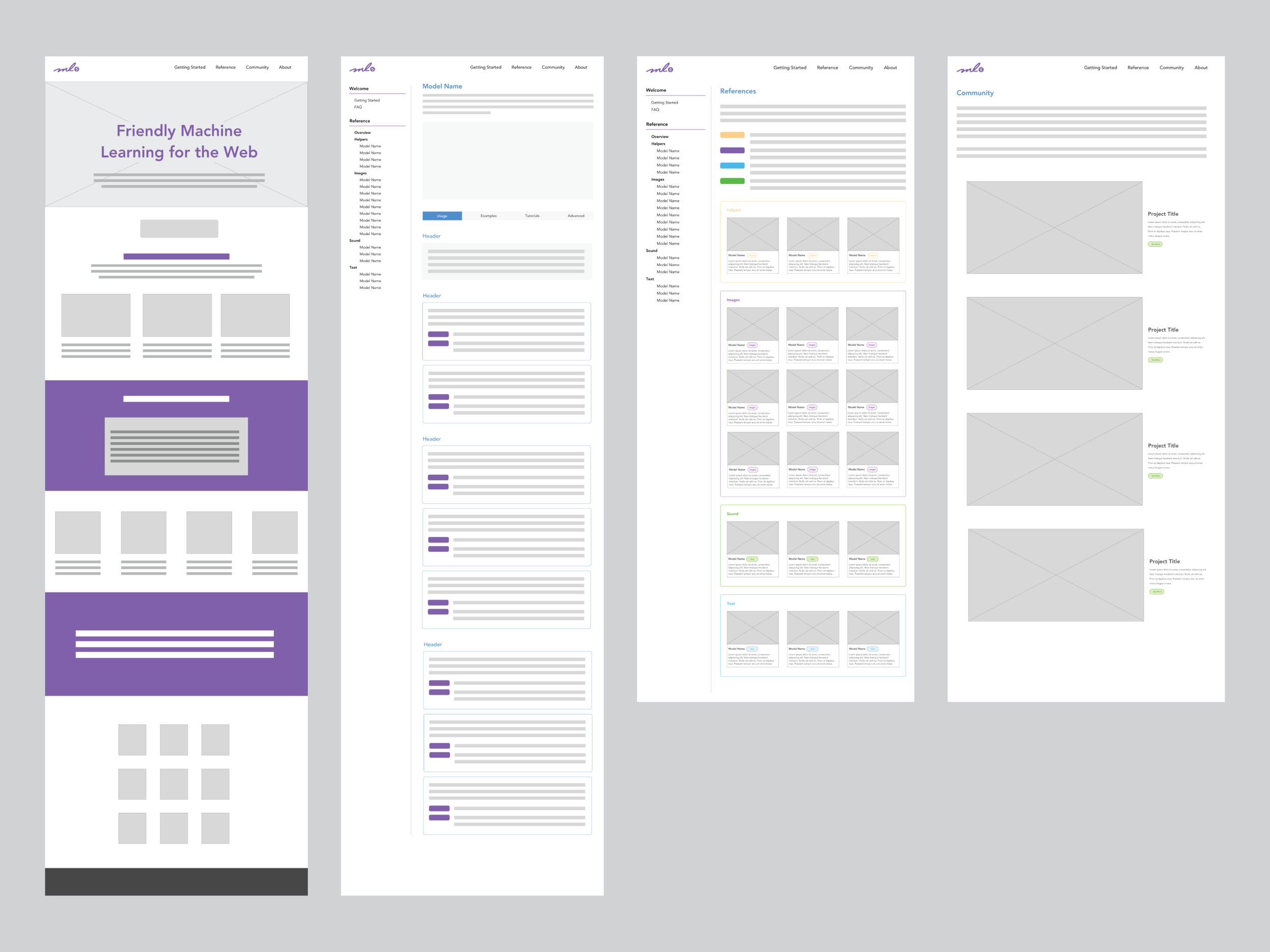
Exploring content layout and navigation for the model pages.
To reduce scroll fatigue often associated with pages with a lot of content and nonlinear workflows, we explored many variations of UI implementations using tabs and listing header anchors within the side navigation.
A complication that we faced trying to tackle this problem was achieving adequate data speeds while running more than one example on a page within the “Examples” sections. Model performance tended to slow down drastically and interactions suffered from extreme lagging.

Style Guide

High Fidelity Prototype
This animation walks through all the major design implementations of the site we were able to achieve with the engineering team.
Final Thoughts
The ml5js team was a pleasure to work with. The community is made up of educators, students, and recent grads, and really embodies a grassroots mentality.
As a lead contract designer, it was really important that I learned how to streamlining workflows and responsibility amongst my team members. An adjustment period was much needed to overcome differences in personalities, work habits and team dynamics. As with any relationship, communication is key!
Reviewing the work that we were able to accomplish, there are a few line items that, while recognized, we failed to address given the resources and available team members we had. In the next version, rather than adding to expand the library offerings, I would really like to focus on and develop the current content. Copy write was a huge issue. Some content still remains to be empty.
I’d also go back to review new analytic data and conduct further usability testing. Due to a very limited timeline, we were unable to actually test the redesign as a whole. In a next iterations, I would love to conduct a series of A/B testing to figure out what content management UI would have best met the needs of our users.